In 2026, accessibility is no longer just a “nice-to-have” feature—it is a core pillar of high-performing digital marketing and search engine visibility. The Coolors Color Contrast Checker is a streamlined, essential utility designed for creators and small business owners who need to ensure their content is readable for everyone. This includes users with visual impairments and those browsing on mobile devices in bright, outdoor lighting.
Using a professional contrast tool ensures your brand remains inclusive, trustworthy, and compliant with evolving international digital standards. When your text is easy to read, your message is more likely to convert.
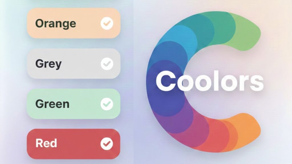
What is the Coolors Color Contrast Checker?
The Coolors Color Contrast Checker is a specialized web utility that calculates the legibility of two overlapping colors. It solves the most common design pitfall: choosing brand colors that look stunning in a palette but become invisible when used in headers or buttons.
Instead of relying on “eye-balling” a design, this tool provides a definitive pass/fail score based on the WCAG (Web Content Accessibility Guidelines). It replaces fragmented workflows with a data-driven approach, allowing you to bake clarity into your brand identity from the very first day of your project.
Why Accessibility is Your Secret SEO Weapon
Many businesses overlook the fact that modern search engines and AI discovery tools now favor websites with high usability and “Mobile-First” design. Using the Coolors Color Contrast Checker helps your brand in several critical ways.
First, it significantly improves User Experience (UX). Higher contrast reduces eye strain and lowers bounce rates because users don’t have to struggle to consume your content. Second, it enhances mobile performance. Accessible designs are much easier to navigate on small screens where glare can often wash out low-contrast text.
Finally, there is the matter of legal compliance. In many regions, meeting WCAG 2.1 AA standards is a legal requirement for digital services. A readable site signals professionalism and a commitment to serving all potential customers.
Favorite Features for Fast Workflows
The Coolors Color Contrast Checker stands out because it doesn’t overcomplicate the technical side of design. It is built for efficiency.
Real-Time WCAG Calculation
The tool provides instant feedback. It tells you exactly whether your colors pass for “Small Text” (requiring a 4.5:1 ratio) or “Large Text” (requiring a 3:1 ratio). This removes all guesswork from your marketing production line.
Interactive HSB Sliders
If your chosen color fails the test, you don’t have to start over from scratch. Use the built-in Hue, Saturation, and Brightness (HSB) sliders to tweak the shade in real-time until it hits a passing score.
Visual Preview & Reverse Tool
You can see a live preview of your text and background combination before you commit. With one click, you can swap the colors to see if your secondary palette is as versatile as your primary one.
Strategic Best Practices for 2026
Accessibility should be foundational, not an afterthought added at the end of a project. To use the Coolors Color Contrast Checker effectively, follow these industry best practices:
- Batch Check Your Palette:
Verify your primary brand colors during your initial setup. Don’t wait until the website is already built to realize your buttons are unreadable. - Aim for 4.5:1 Minimum:
While 3:1 is acceptable for large headers, aiming for 4.5:1 across the board ensures maximum readability on mobile devices. - Test for Dark Mode:
Always check how your accent colors perform on both pure white (#FFFFFF) and dark grey backgrounds to ensure versatility. - Use Documentation:
Save screenshots of your passing scores to guide external vendors, like printers or web developers, to ensure consistency.
Optimizing VA Partnerships with Standardized Tools
For business owners working with a Virtual Assistant (VA), this tool creates a “shared language” for quality control. It eliminates subjective debates about whether a graphic “looks okay.”By mandating the use of the Coolors Color Contrast Checker, you ensure that the assets your VA produces are professional and inclusive without needing to micromanage every design choice. You set the standard once, and the tool enforces it.f support into your business, we can discuss hiring a Virtual Assistant and explore the right setup for your team.
Final Thoughts
The Coolors Color Contrast Checker is an essential tool for anyone who values clarity and professional execution. By prioritizing legibility, you aren’t just following rules—you are reaching a wider audience and building a more sustainable, trusted brand.
Get started with the tool here:
FAQs
Is the Coolors Color Contrast Checker free to use?
Yes, it is a free web-based tool. There is also a mobile app suite available for checking palettes while you are on the go.
What contrast ratio should I aim for?
For standard body text, you should aim for at least 4.5:1 to meet Level AA compliance. For larger headlines, 3:1 is often sufficient.
Does it support all hex codes?
Yes, it supports any standard 6-digit hex code, which is the universal standard for digital design and web development.
Can I check my logo contrast?
While logos are technically exempt from WCAG requirements, it is still a best practice to ensure your logo is legible against any background colors you use on your website.